In depth

A liminal space in a constant change

An infinite room, that is in constant change. A liminal space that never stays the same. It is growing, breathing and changing over time. The Room consists of stations. Stations that never remains in the same position.


They move and change over time. Everyday, the room changes. In one year, there will have been 365 different versions of the room.


Concept

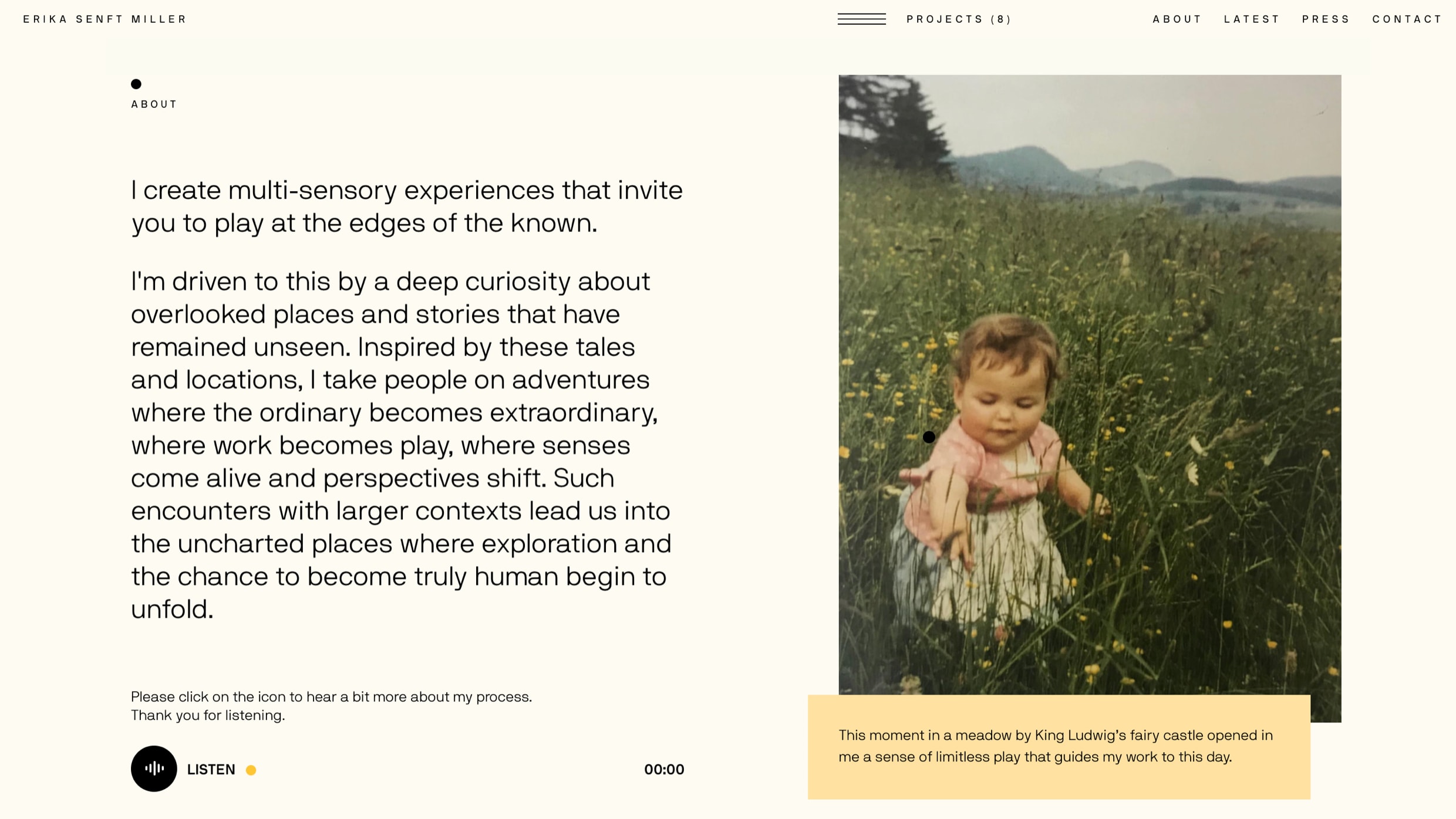
We designed an endless canvas with multiple layers of sound, photography, video and copy. The organic shapes signify portals into Senft Miller’s work and the navigational compass plays with the notion of going beyond the edges of the known, allowing each visitor to navigate in their own direction.


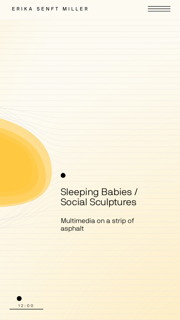
We wanted to create a unique experience everytime a new user visitied the site. The website needed to be a alive and in constant change adapting to the work, environemnt and art. The content gets repositioned so no project page is ever the same, and the color scheme changes based on the time of day.


Early wireframes and concepts

We were originally inspired by layers of content living in en open canvas where they could freely move around. As the project developed over time, a more unique design direction was created that used organic bubles as wormholes that lead the user into a more curated experience specific for that project.


The video below shows our design exploration throughout the project which invovled various tryouts with different type faces, colors and layouts.


Erika Senft Miller Design Exploration and style tiles.

A Dynamic Color Sheme

During early creative reviews the challenge arose to think of the website as a living, breathing, art piece and thus took on a life of its own. An organic, mustard colored shape was salvaged from an early round of concepting, and from there the site evolved element by element.


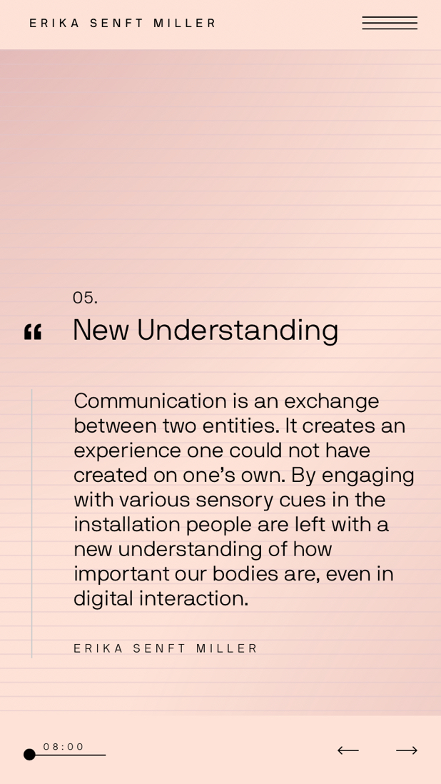
We created 4 different color schemes each representing a differnt time of the day. Dawn, daylight, evening and night.

The colors would also change depending on the day the project was held. It was important for Erika that the artwork was presented en the most accurate natural light.

A Unique Experience in every visit

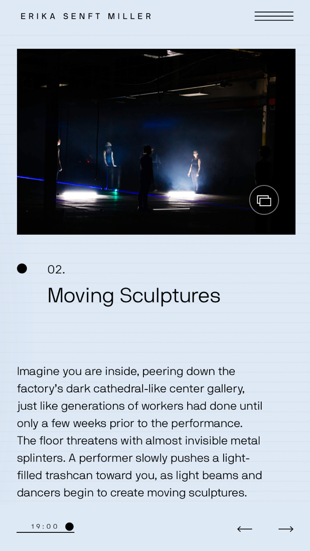
Each project has a unique layout and changes everytime the user visits the page. Each module and element adapts and gets repositioned so each experience is different. We wanted to create a leaving and breathing room where no visit was ever the same. We wanted the user to be curious, explore and have a sense of play.


Each module gets repositioned every time a user revisits the project page.

The experience is quite unqiue, and so are the user experience and the way the user navigates the site. It’s playful but serious. We created a set of unique cursor icons to help the user better navigate and interact with the experiene. One of the cursors acts as a compass and guies the user throughout the experience.


Custom navigation cursor

Commentary Audio Interviews

During our meetings with Erika, we heard and saw a completely different side of her as an artist. The way she talked about each project was extreme fascinating, and something we wanted to bring forward to the user.


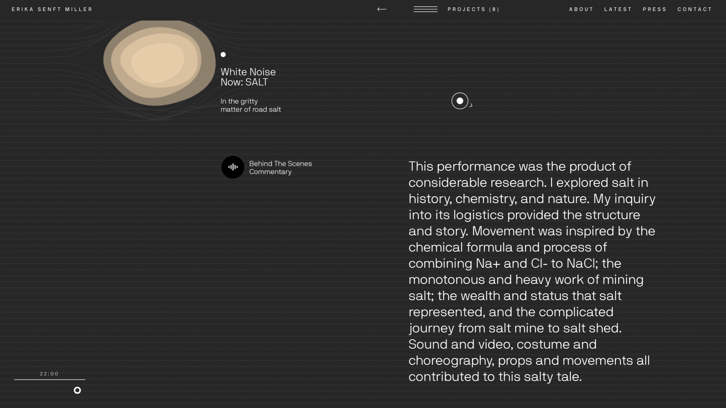
We recorded behind the scenes audio tracks for each project that talks about the project from a more human angle. It’s an honest Erika talking about each project in a more human form.


Behind the scenes audio module.

Type:

Experiences

Branding

Client:

Erika Senft Miller

Deliverables:

Development, UI, UX, Concept, Copywriting

Artist. Creator. Performer. Collaborator. Human.

Artist Erika Senft Miller creates multi-sensory art experiences that are meant to be explored freely. Combining multiple elements such as space, sound, performance, and time of day, a true Senft Miller experience is an exploration that unfolds in layers.

In collaboration with Senft Miller, our challenge was to create a digital space where users could explore what a signature Senft Miller performance feels like while also viewing past work and getting to know the artist. Our solution was to develop an infinite canvas that is part archive, part digital performance space, where the act of visiting the website doubles as its own experience.

Leveraging dynamic content from Senft Miller's archives, we were able to design original, complimentary elements that showcase the artist and her work. From the navigational compass to the website's overall color palette that changes depending on the users timezone, each visit to the website is unique — changing throughout the course of the day, week and year.

In depth

01

Concept

02

A Dynamic Color Sheme

03

A Unique Experience in every visit

04

Commentary Audio Interviews

Concept

In the discovery phase, our approach was to imagaine the website as a living, breathing art piece. An organic, mustard colored shape was salvaged from an early round of concepting, and from there the site evolved element by element.

Performance Art

On the homepage, each floating bubble acts as portal that leads to a different project. We tapped into the themes of movement and unpredictability that Senft Miller often channels in her own work, to create a series of soft, round, organic shapes that morph when entering the linear terrain.

A Dynamic Color Palette

Senft Miller carefully considers how time of day impacts each of her projects. Inspired by this notion, we developed a color palette that changes throughout the course of the day — from sunrise to sunset, no two visits are the same.

Assembling a Toolbox

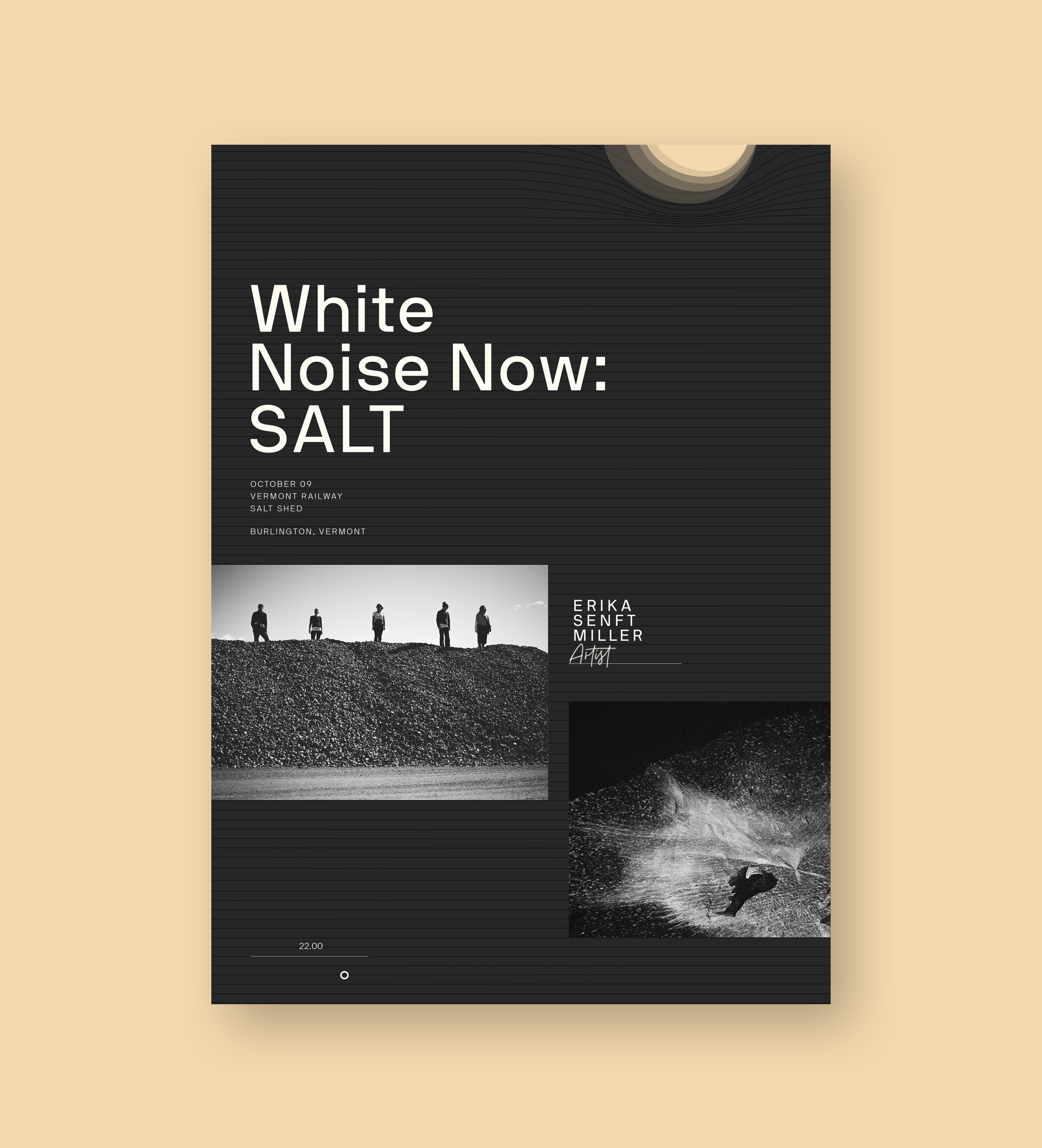
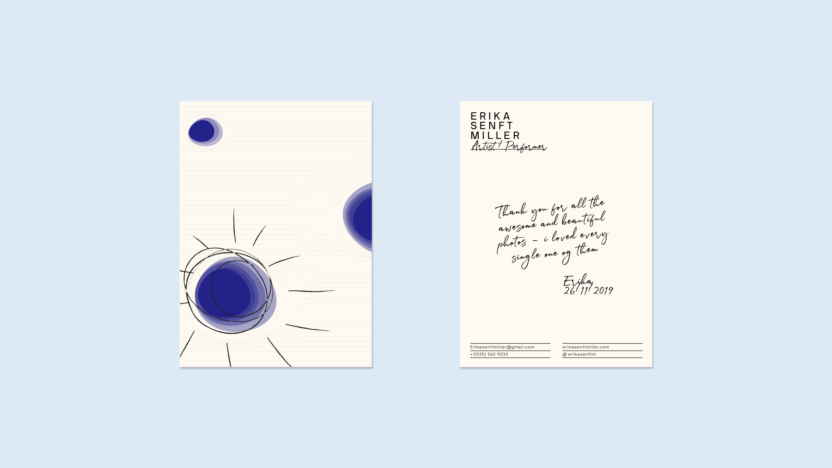
We created a brand identity toolbox for Senft Miller to implement across her digital and social platforms, as well as print materials. The toolbox consists of a logo lockup, a color palette and a collection of design elements and icons that also appear across the website.

Project awarded:

Awwwards

Site of the Day


FWA

Site of the Day


Creative Circle

Design & Digital Design — Craft / Website Design, Gold
Design & Digital Design — Craft / Creative Programming, Gold

Related projects

Something something
We creates joyful digital ideas, products, brand identities and experiences that connect the hearts of brands to the hearts of their audiences.