Designing the Kids Space Universe
Branding,Products
Type:
Branding
Client:
Netflix
Deliverables:
Animation, Concept, UI, Design
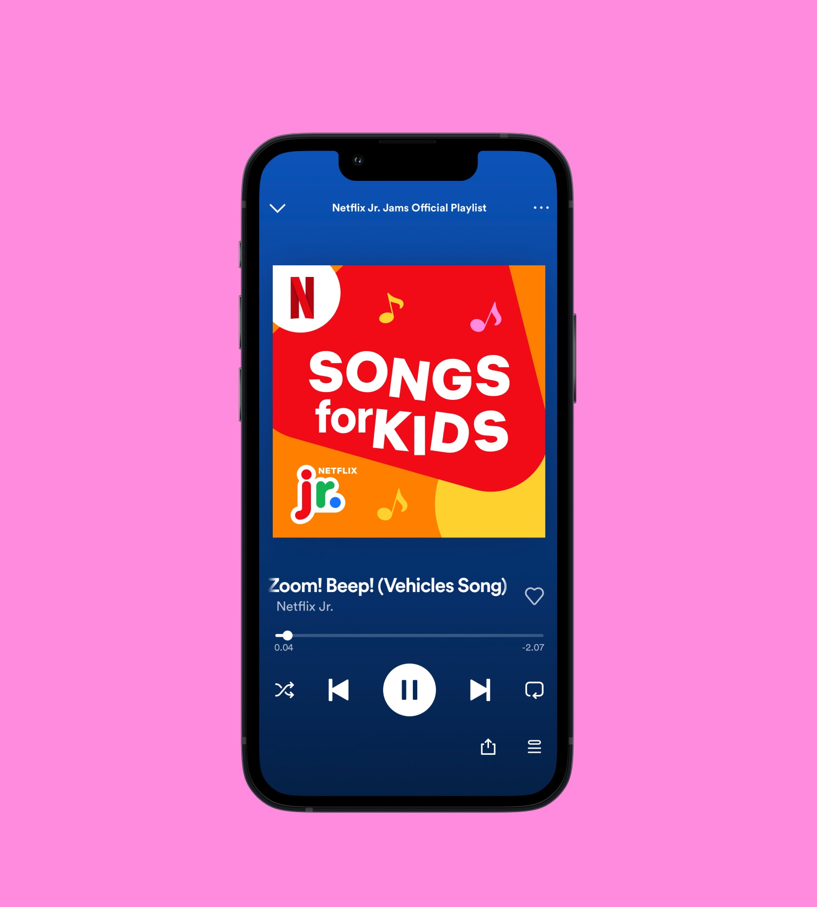
Netflix Kids & Family connects families with the series and films they love. Netflix collaborated with us to create new logos and unified visual identity for Netflix Kids and Family. We worked closely with the creative team at Netflix to capture the essence of the age-specific audience. Thereby making each identity feel both unique and still cohesive, and visualizing that Netflix is for EVERYONE.
We wanted to embrace the powerful feeling of joy with pops of colors, multiplicity, lightness, and rounded shapes for Netflix Kids. We welcomed primary shapes for Netflix Jr, whilst vibrant colors and playful typography speak to the quirk and independence of Netflix After School. Together, the identities join forces to create a delightful, welcoming and adventurous look & feel that reflects the Netflix Kids & Family mission.
As one of the world's leading streaming services, Netflix recognized the importance of providing an intuitive, adaptable, and inclusive experience for audiences of all ages.
The design included elements that spark joy, like pops of colors, multiplicity, lightness, and rounded shapes. The cloud-like stroke was used to interpret the safe space Netflix creates for Kids & Family across platforms, a design language that can transcend cultures.
The Netflix Kids & Family ecosystem is a treasure trove of entertainment for families worldwide. These initiatives cater to different age groups and interests, making them a hit for parents and kids.
We found a way to unify the identities while capturing the essence of their respective audiences and reinforcing their intuitive, adaptable, inclusive experience.


