Reinventing the US healthcare industry
Branding
Type:
Branding
Client:
Bearaby
Deliverables:
UI, UX, Concept, Design, Illustration
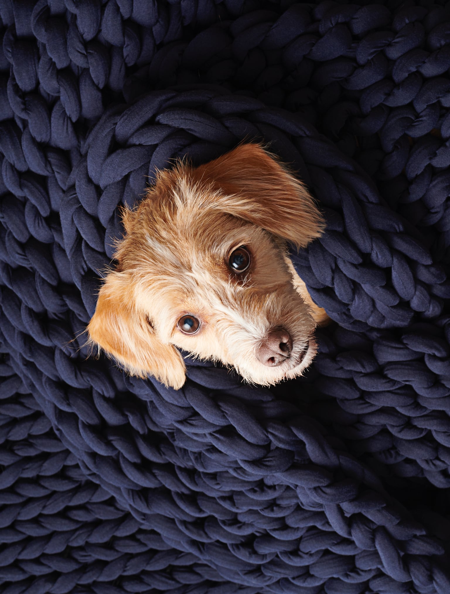
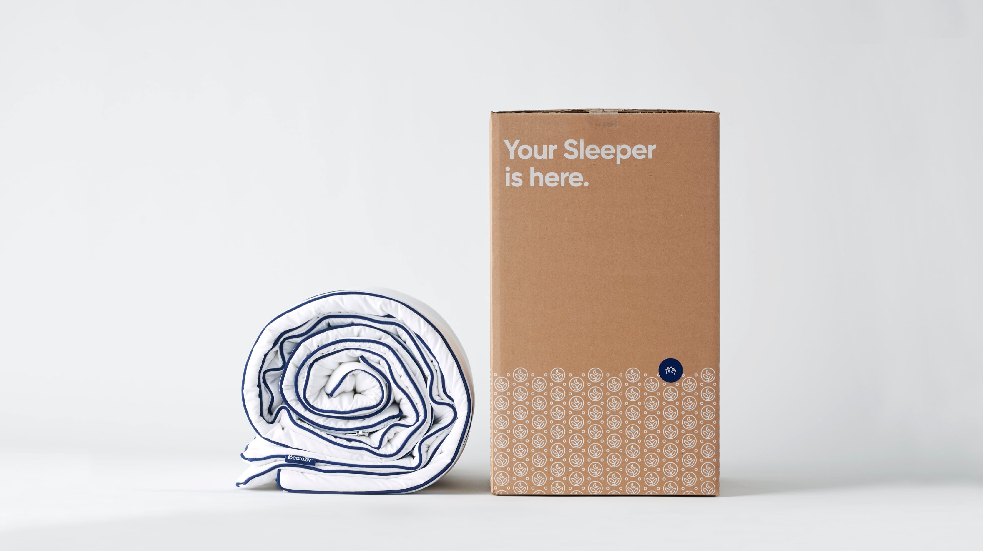
Bearaby uses scientific research and patented air circulating technology to create weighted bedding that enhances breathability and keeps your body at an optimal temperature, promoting a restorative sleep and debunking the myth that deep, restful sleep is hard to experience.
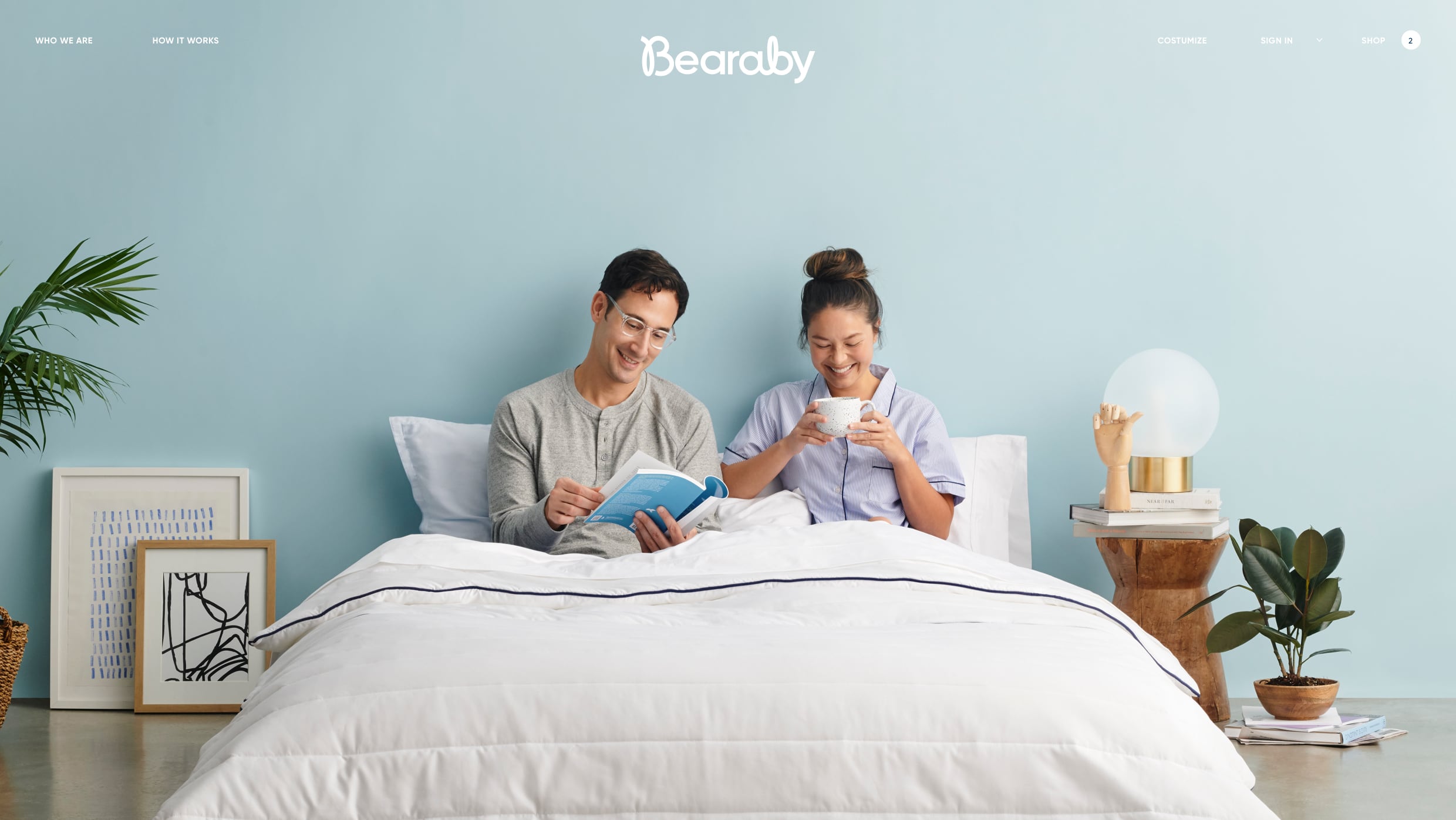
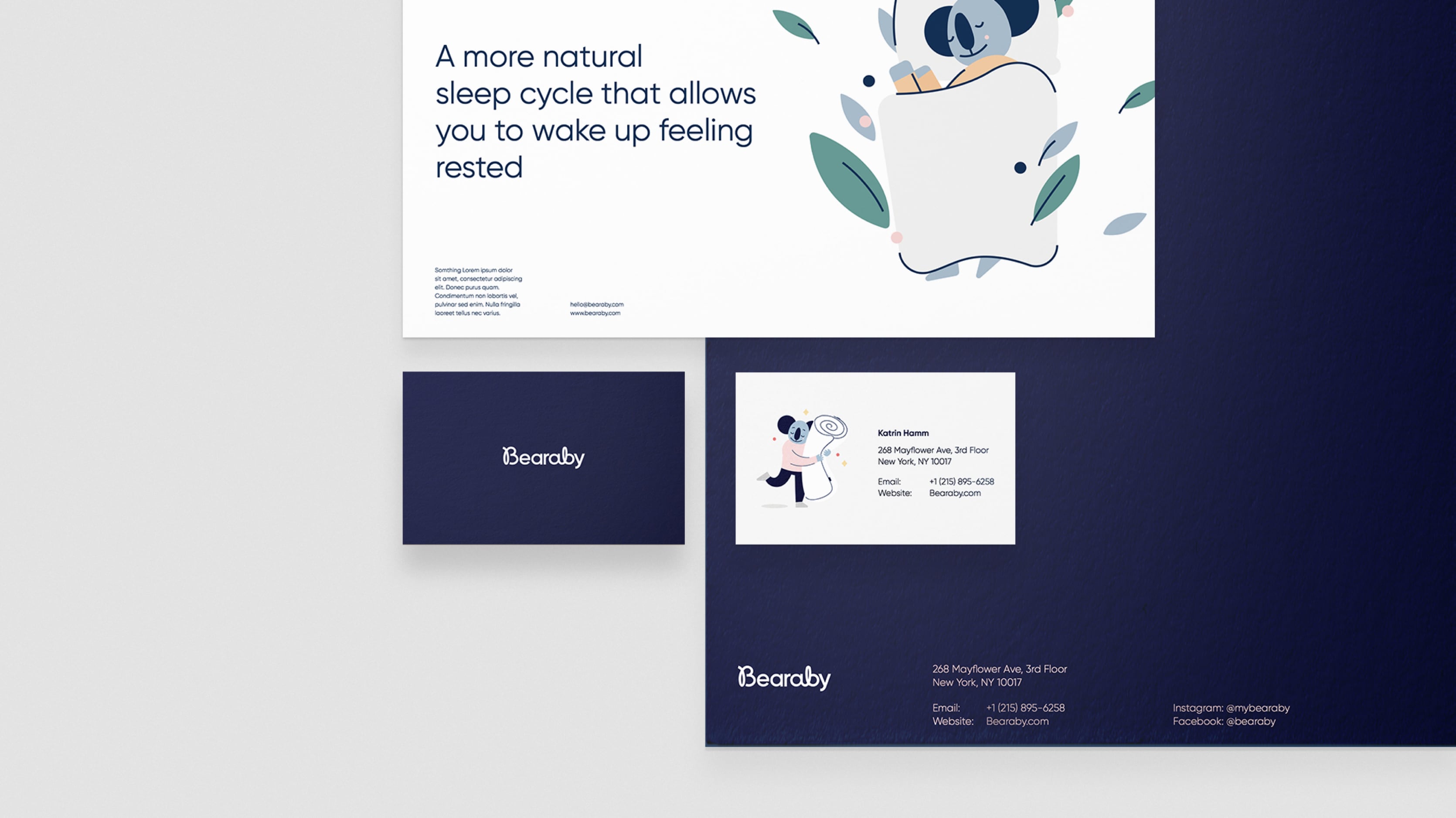
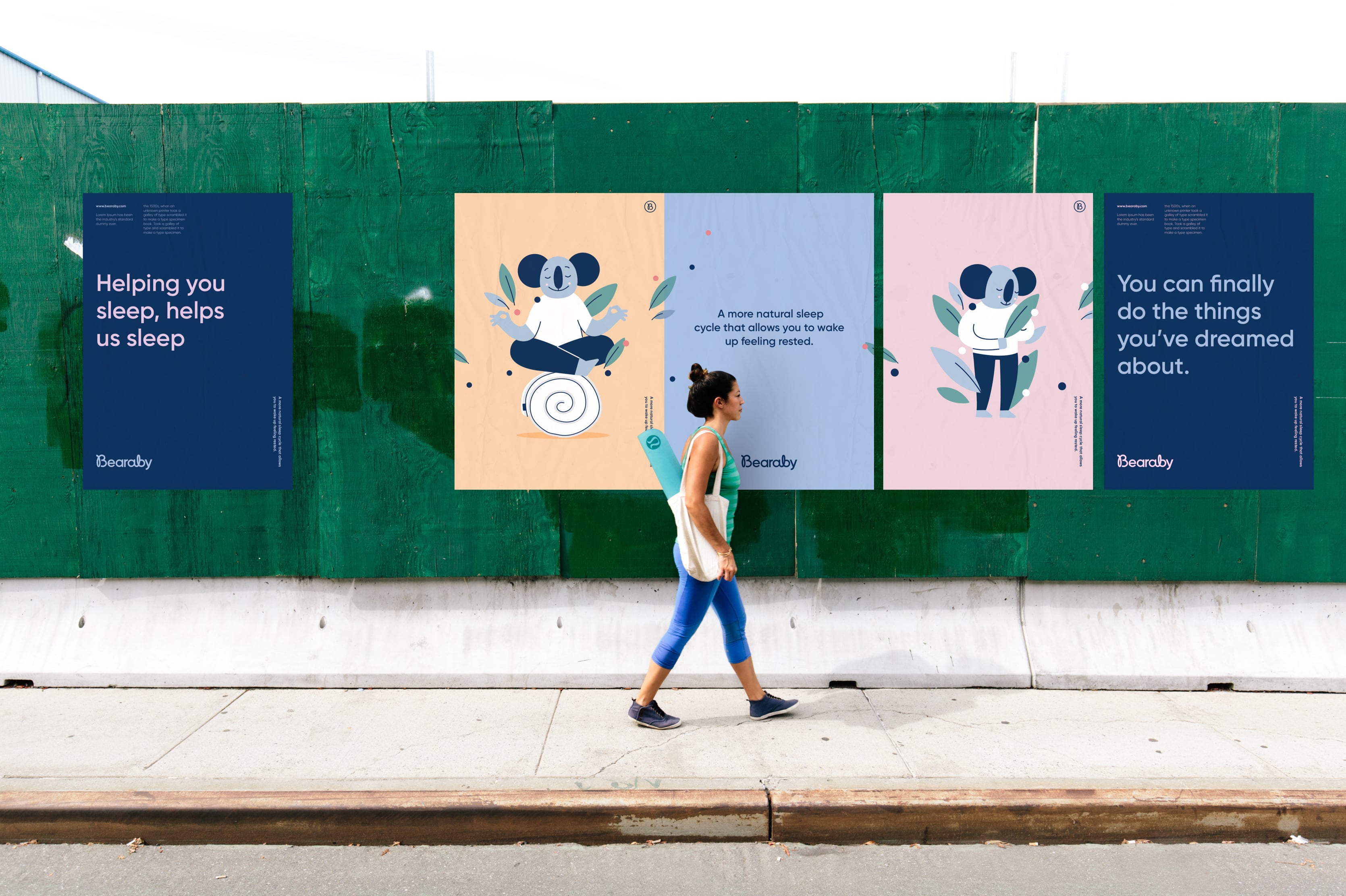
The challenge was to design Bearaby’s fundamental brand elements that could strike a balance between lifestyle and science. We created a strong brand identity and visual system that communicates the benefits of weighted sleep whilst highlighting the brands use of sustainable and natural fibres. The iconography is built on the stroke from the Bearaby logo mark and the patterns were created to represent the unique features and benefits of the Bearaby products. All brand elements from logo to colour palette create a recognizable and distinct brand identity.
With it’s calm loopy ascenders and repetitive, connected stroke, the Bearaby logo visualizes the concept of “a good night’s sleep” - calming and continuous.
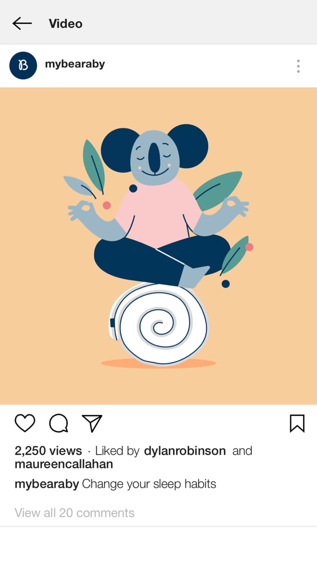
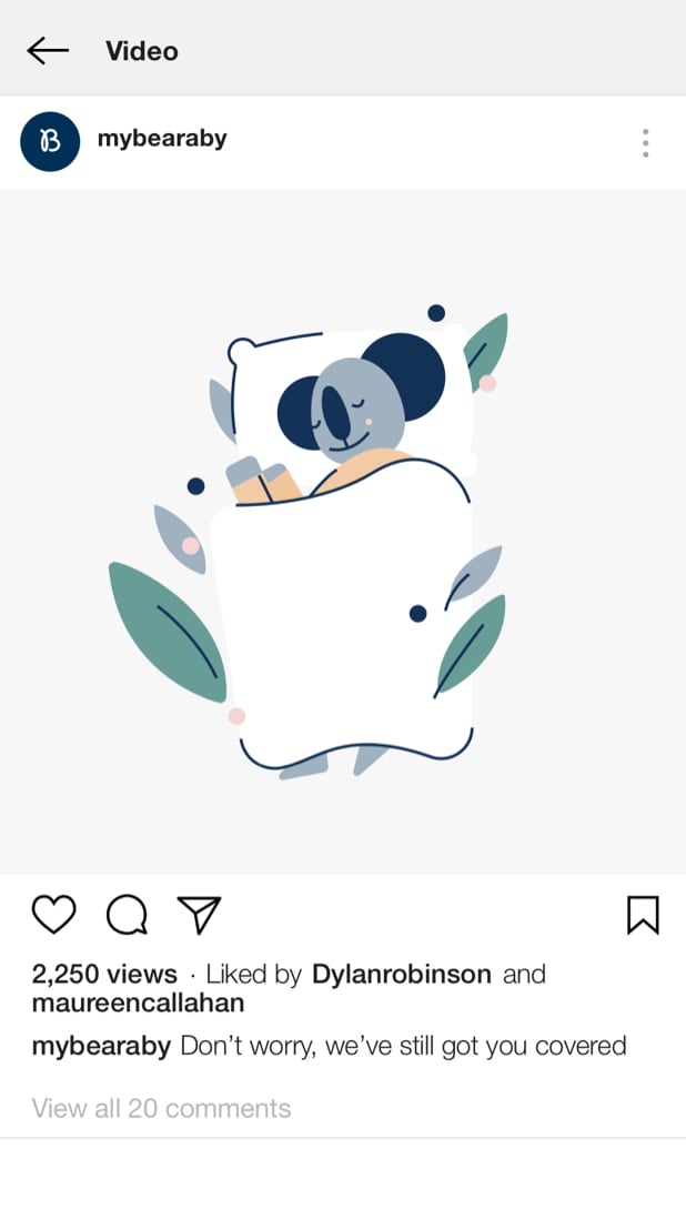
Character drawings illustrate the relatable and emotional experiences people have with sleep.
